Suburban Fairy Tales

A comic strip starring the three pigs and other fairy tale characters in modern suburbia!
  • FrancisBonnet.com
  • Books
  • Characters
  • Bio
  • Other Comics
  • Fan Art
  • Contact
  • Press & Links

Distributed by King Features Syndicate. Read the newest comics on Comics Kingdom.

The Evolution of Dot Eyes

Apr13
by francisbonnet on April 13, 2012 at 12:45 pm
Posted In: News Blog

One thing that I’ve always found the most difficult to draw in cartoons are “dot eyes.”

Before I attempted drawing dot eyes for the first time, I would always draw a character’s eyes as a circle with a dot in the middle to show their pupil.  In my style of cartooning, that method looks like a mix between Garfield’s eyes and big Japanese manga-style eyes.  When I started Suburban Fairy Tales in 2005, Little Pig #3’s character design screamed out to me that dot eyes would suit him best, so I thought I would go ahead and try something different.

Little Pig #3 circa 2005

At first, I drew Little Pig #3’s dot eyes perfectly round with a little shine in the corner – they looked almost like little black buttons on his face.  I found this way of drawing eyes much more challenging than in my past cartoons.  Sure, I’ve used dot eyes occasionally, but never on a main character.  Using this method introduced some new challenges.  How do I use dot eyes to show varying degrees of emotion?  How do I show dot eyes looking up, down, left or right?  It was always so simple with my usual way of drawing eyes, but now I was struggling.

Error the robot from "Made To Malfunction"

As long-time fans know, Suburban Fairy Tales took a two-year hiatus starting in 2006 so I could concentrate on Made To Malfunction.  The star of this new series was a robot named Error, who also happened to have dot eyes.  The way I drew Error’s dot eyes differed from the way I drew Little Pig’s.  Error’s eyes were drawn more oval instead of circular, and gone was the little shine that was present in Little Pig #3’s eyes.  Being that Error was now the star character, he was featured in almost every strip.  So I really had to push the way I drew dot eyes the next two years.  By the time Made To Malfunction ended in 2008, I felt I had come a long way with conveying emotion using dot eyes.

When Suburban Fairy Tales re-started in 2008, I took what I learned from drawing the robot Error and applied it to Little Pig #3.  Gone were the little circular button eyes with the shine that I had previously drawn him with.  Instead I took the same eyes what I had used for Error – big, black oval dot eyes – and put them on Little Pig #3.  Humpty Dumpty and Goldilocks (a new character) also used these types of eyes as well.

Little Pig #3 with BIG dead-looking dot eyes in 2009

The problem with the big black oval dot eyes on Little Pig #3 (and on Goldilocks and Humpty) was that Error was a robot.  Big black oval dot eyes worked well on something made of metal and circuits.  But Little Pig #3 was organic, a living thing.  Taking a machine’s eyes and applying them to Little Pig didn’t turn out to be the best idea.  Error’s dot eyes were just too big for Little Pig’s face – he looked like he was dead!  So as time went on, I shrunk Little Pig #3’s dot eyes (along with Goldilock’s and Humpty’s) to a more acceptable size.  Now the size I draw dot eyes are just a tad above what Charles Schultz used for his characters in Peanuts.

The way I draw dot eyes has been a bit of a roller coaster ride from when I first started, but I’m very happy with the way they have evolved. As they say with anything you do — you only get better with practice.

Little Pig #3 as he looks in 2012

 Comment 

A Smile for Savannah Smiles

Mar09
by francisbonnet on March 9, 2012 at 3:30 pm
Posted In: News Blog

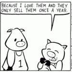
So I did this Girl Scouts cookies gag a few weeks ago.  Little Pig #3 talks about how much he loves Girl Scouts cookies, ordered a year’s worth of cookies and then it all ends with a funny punchline (at least I thought it was funny).  The interesting thing is that it’s actually me speaking through Little Pig #3, because I (like most of America) love Girl Scouts cookies.  My favorite has always been Samoas, but I just got a chance to try out their new cookie, Savannah Smiles, and I now I have another favorite.

Okay, so bottom line — Do I like Savannah Smiles cookies as much as Samoas? No, but they are a close second.  The cookie has a very lemony taste — almost as if someone took lemonade flavoring and injected it into a gingerbread cookie.  It’s pretty yummy… and just like Little Pig #3, I don’t think I’ll want to share them.

This time of year when Girl Scout cookies are being sold I tend to only order Samoas.  Why would I order something else when I only want to eat my favorite?  Well, this year I decided that I’ll be ordering a mix of Samoas and Savvanah Smiles.  Besides, cookies make an excellent snack to munch on when you’re cartooning.

Anyway, I hope you enjoyed my advertisement for Girl Scout cookies.  I should get paid for this.

 Comment 

What’s in a Name?

Feb17
by francisbonnet on February 17, 2012 at 1:29 pm
Posted In: News Blog

Coming up with the name of a comic strip isn’t necessarily an easy process.  You want your title to be something different than what’s already out there, and you also want it to be memorable.  But most importantly, you want to make sure that you pick a name that will allow your strip to grow and change.

I’ve made the mistake of limiting the growth of my comic strip in the past with Crunchy.  Crunchy originally followed the adventures of a pet turtle of the same name.  As the strip went on, however, Crunchy the Turtle was featured less and less.  Soon the strip started to focus more on the neighborhood kids and Crunchy the Turtle went from the strip’s star character to a recurring character.  After I ended Crunchy I made a mental note that the title of my future comic strip series would leave them more open for evolution.

Shortly after Crunchy ended I came up with the concept for Suburban Fairy Tales.  I had originally thought that Fairy Tale High School would be a good name, but then I thought… what if I don’t want them to be in high school anymore?  What if in ten years I wanted my characters to go to college or even beyond?  As a comic strip writer, you never know where your mind will be in five, ten, or twenty years from now. Suburban Fairy Tales sums up the concept that my strip is about Fairy tales characters living in a suburban community.  There’s plenty of room for growth and change in that title.

Charles Schulz’s Peanuts is a great example of what a comic strip title should be.  I know he hated the name and Lil’ Folks would have definitely been better, but the point I’m trying to make is that the name Peanuts didn’t handcuff the strip to its original premise and characters.  If Schulz had titled his comic strip The Adventures of Charlie Brown, Shermy, and Patty he would have been forced to use those three characters for the next 50 years.  But Shermy and Patty eventually disappeared from the strip and the Peanuts of the 1950s is a completely different strip from Peanuts of the 1990s.  Peanuts was allowed to grow and evolve because the name didn’t hold it back.

So when coming up with the name of a comic strip, keeping your title open is advice you may want to consider.  Because what you’re writing about when you’re 15 isn’t necessarily the same thing you want to be writing about when you’re 30.

 Comment 

Goldilocks or Alice?

Jan03
by francisbonnet on January 3, 2012 at 1:00 am
Posted In: News Blog

As all my loyal readers know, in my comic strip Goldilocks is the second most popular girl in school after Rapunzel.  But when Goldilocks first appeared in Suburban Fairy Tales back in March 2009, she was actually supposed to be Alice from Alice in Wonderland.  Crazy, huh?

Goldilocks in March 2009As you can see from this first picture,  I originally drew “Goldilocks” with straight hair, not the curly “locks” that she has always been depicted with in the original fairy tales.  Why did I design her this way?  Well, that’s because she was Alice!  It wasn’t until I was cleaning up in the artwork from her first appearance in Photoshop that I realized Alice just wouldn’t be a good sidekick for Rapunzel.  I needed a fairy tale character who was more self-centered and snobby.  Then I thought about Goldilocks and the Three Bears.  In the original fairy tale, Goldilocks apparently had no qualms about breaking into the three bears’ house, sleeping in their beds and eating their food.  A character as self-centered as THAT would definitely be a much better sidekick than Alice.  So in Photoshop I changed all references of her as “Alice” and made them “Goldilocks.”

The only proGoldilocks in December 2011blem with the quick name change was that it was too late to change the artwork. Suburban Fairy Tales’ Goldilocks didn’t really look anything like classic Goldilocks and that kind of annoyed me.  So with each subsequent appearance I gradually gave her longer hair and “curled” it to give her the appearance of having “golden locks.”  This second image of her was from her latest appearance in December 2011.  I’m much happier with my new Goldilocks’ character design.

So why does any of this matter?  Well I wanted to use this as an example to show that I’m not above making corrections to my strip.  Sometimes I look back at my work and think about how I should have done things differently.  One good example of this is coming up in a future storyline.  I don’t like my Prince Charming — I don’t like this personality or his character design.  So I’m going to introduce another Prince Charming.  Oh, don’t worry, there will be an explanation… but I don’t plan on spoiling it here!

2 Comments

Drawing Suburban Fairy Tales

Dec06
by francisbonnet on December 6, 2011 at 1:09 pm
Posted In: News Blog

Drawing a comic strip is a thoughtful process.  Most of the time I sit down for an hour or so and sketch a whole bunch of ideas into my sketchbook — whatever comes to mind, good or bad.  Then the following day I’ll go back to my sketchbook and re-read my ideas.  Sometimes the ideas are really great and they go right into the comic strip.  Other times the ideas are so-so, but have potential, so I attempt to re-write them to make them better.  Other times the ideas are simply awful and I put a big X through them.

Sitting down to write these ideas is a pretty straightforward process, but sometimes an idea comes to me out of the blue.  That’s when I have scramble to write it down somewhere because I know that in two minutes I’ll be distracted by something else and forget the idea entirely.

One example of an idea popping up is when I was sitting at my booth at NY Comic Con.  I was drawing sketches for fans who purchased a copy of my book.  Most of the sketches were characters in simple poses, but one sketch featuring Red Riding Hood spawned an idea that I thought would be great for the actual comic strip.  So I made sure to snap a picture of that sketch before I gave it away so I could remember it for later use in Suburban Fairy Tales.

Below is the original sketch idea from NY Comic Con.  The other photos are each step I take in drawing a strip — from pencils to the final product.  The final completed strip was posted on October 28, 2011.


 Comment 
  • Page 25 of 26
  • « First
  • «
  • 22
  • 23
  • 24
  • 25
  • 26
  • »

September 2025
S M T W T F S
« Aug    
 123456
78910111213
14151617181920
21222324252627
282930  

Suburban Fairy Tales updates every Monday, Wednesday, and Friday on Comics Kingdom.

Follow me on Social Media:

Visit Us On InstagramVisit Us On TwitterVisit Us On FacebookVisit Us On Youtube

Latest Comics

  • 09/26/2025
  • 09/25/2025
  • 09/24/2025
  • 09/19/2025
  • 09/18/2025

Suburban Fairy Tales is distributed by King Features Syndicate. Read the newest strips on Comics Kingdom.

©2005-2025 Suburban Fairy Tales | Powered by WordPress with ComicPress | Subscribe: RSS | Back to Top ↑