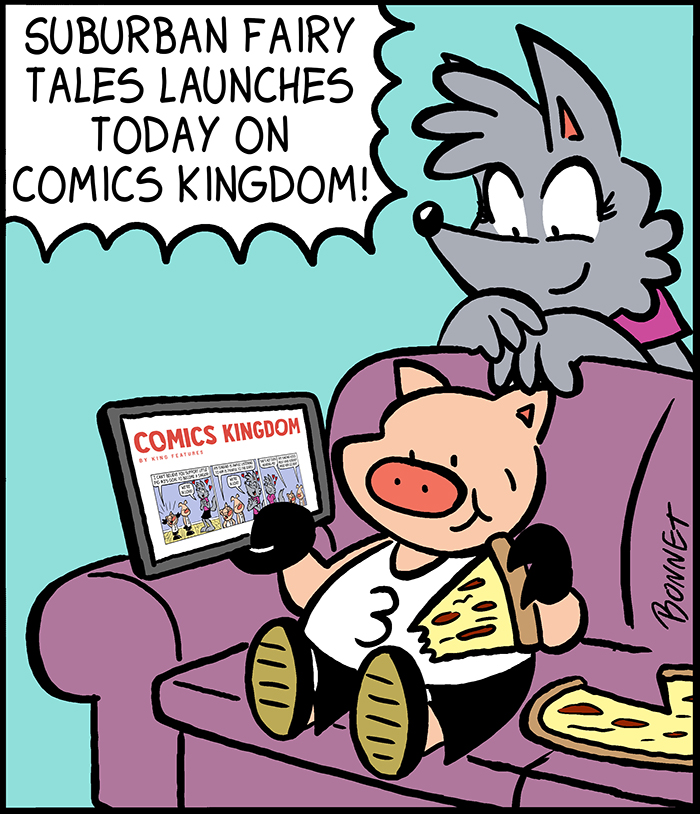
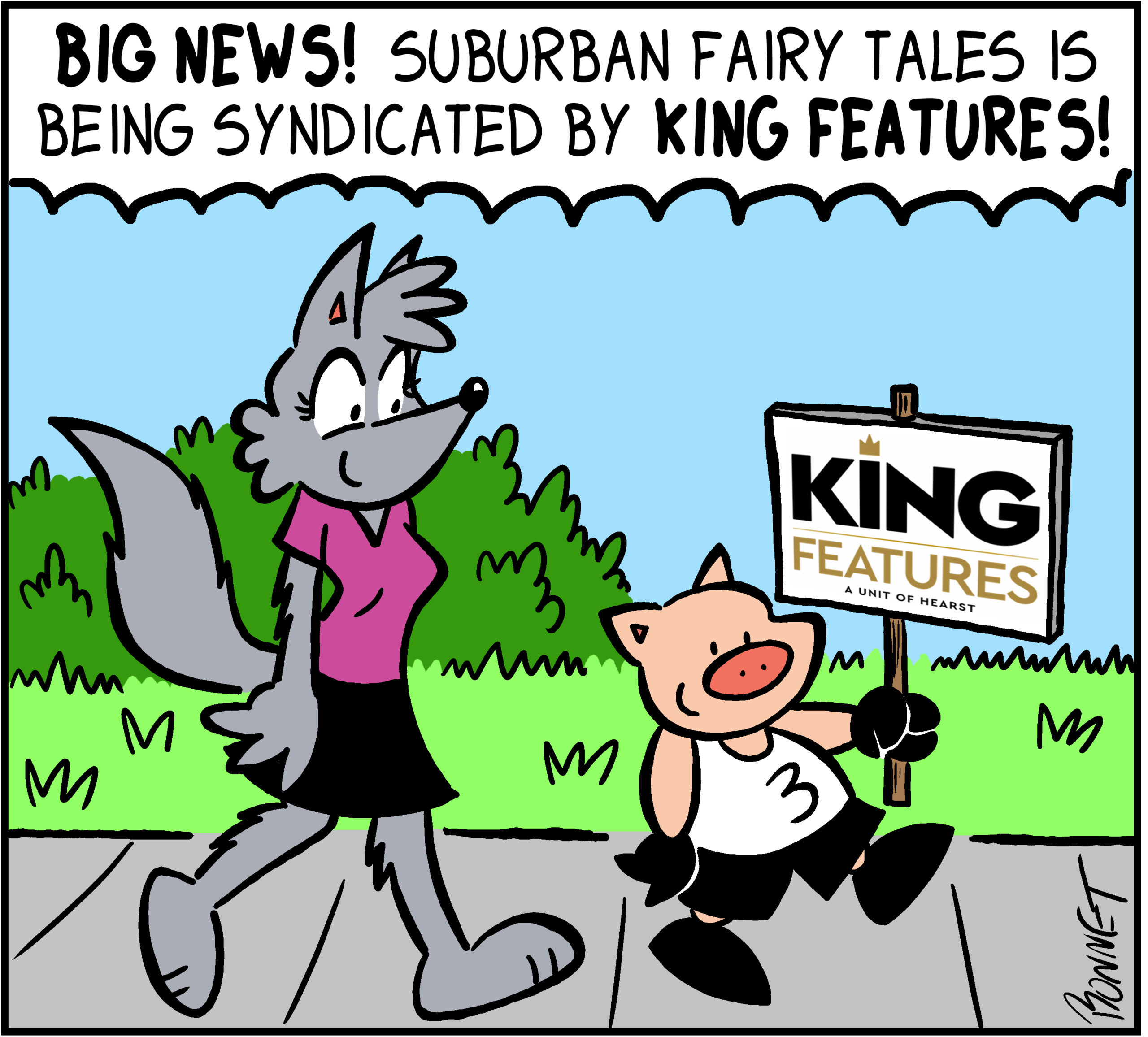
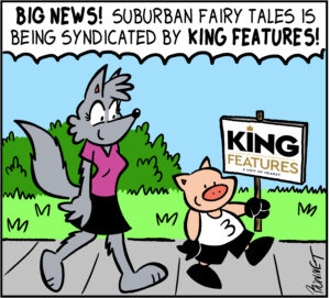
New Suburban Fairy Tales Book Cover Revealed!
by francisbonnet on May 15, 2012 at 10:57 amA third Suburban Fairy Tales book collection is coming out this summer, and here's a sneak preview of the tentative cover. Titled, I've Got a Frog Prince in my Throat, the book should be published this July.
In addition to featuring two years worth of Suburban Fairy Tales comic strips, the new book will also contain an assortment of previously unpublished work exclusive to the book.
Keep checking back for more information on the official release date. Your comments regarding the cover are always welcome!
An Abundance of Suburban Fairy Tales
by francisbonnet on April 20, 2012 at 10:05 amA double review of the second Suburban Fairy Tales collection, This Little Piggy Gets Even is up on Spandexless.com. What’s interesting is that two different writers reviewed it and they both had contrasting opinions.
If you’re interested in reading the reviews check them out on Spandexless. The site is also a great resource for those of you looking to read about and discover comics that have nothing to do with superheroes (hence the name Spandexless).
One thing that I’ve always found the most difficult to draw in cartoons are “dot eyes.”
Before I attempted drawing dot eyes for the first time, I would always draw a character’s eyes as a circle with a dot in the middle to show their pupil. In my style of cartooning, that method looks like a mix between Garfield’s eyes and big Japanese manga-style eyes. When I started Suburban Fairy Tales in 2005, Little Pig #3’s character design screamed out to me that dot eyes would suit him best, so I thought I would go ahead and try something different.
Little Pig #3 circa 2005
At first, I drew Little Pig #3’s dot eyes perfectly round with a little shine in the corner – they looked almost like little black buttons on his face. I found this way of drawing eyes much more challenging than in my past cartoons. Sure, I’ve used dot eyes occasionally, but never on a main character. Using this method introduced some new challenges. How do I use dot eyes to show varying degrees of emotion? How do I show dot eyes looking up, down, left or right? It was always so simple with my usual way of drawing eyes, but now I was struggling.
Error the robot from "Made To Malfunction"
As long-time fans know, Suburban Fairy Tales took a two-year hiatus starting in 2006 so I could concentrate on Made To Malfunction. The star of this new series was a robot named Error, who also happened to have dot eyes. The way I drew Error’s dot eyes differed from the way I drew Little Pig’s. Error’s eyes were drawn more oval instead of circular, and gone was the little shine that was present in Little Pig #3’s eyes. Being that Error was now the star character, he was featured in almost every strip. So I really had to push the way I drew dot eyes the next two years. By the time Made To Malfunction ended in 2008, I felt I had come a long way with conveying emotion using dot eyes.
When Suburban Fairy Tales re-started in 2008, I took what I learned from drawing the robot Error and applied it to Little Pig #3. Gone were the little circular button eyes with the shine that I had previously drawn him with. Instead I took the same eyes what I had used for Error – big, black oval dot eyes – and put them on Little Pig #3. Humpty Dumpty and Goldilocks (a new character) also used these types of eyes as well.
Little Pig #3 with BIG dead-looking dot eyes in 2009
The problem with the big black oval dot eyes on Little Pig #3 (and on Goldilocks and Humpty) was that Error was a robot. Big black oval dot eyes worked well on something made of metal and circuits. But Little Pig #3 was organic, a living thing. Taking a machine’s eyes and applying them to Little Pig didn’t turn out to be the best idea. Error’s dot eyes were just too big for Little Pig’s face – he looked like he was dead! So as time went on, I shrunk Little Pig #3’s dot eyes (along with Goldilock’s and Humpty’s) to a more acceptable size. Now the size I draw dot eyes are just a tad above what Charles Schultz used for his characters in Peanuts.
The way I draw dot eyes has been a bit of a roller coaster ride from when I first started, but I’m very happy with the way they have evolved. As they say with anything you do — you only get better with practice.
Little Pig #3 as he looks in 2012
So I did this Girl Scouts cookies gag a few weeks ago. Little Pig #3 talks about how much he loves Girl Scouts cookies, ordered a year’s worth of cookies and then it all ends with a funny punchline (at least I thought it was funny). The interesting thing is that it’s actually me speaking through Little Pig #3, because I (like most of America) love Girl Scouts cookies. My favorite has always been Samoas, but I just got a chance to try out their new cookie, Savannah Smiles, and I now I have another favorite.
Okay, so bottom line — Do I like Savannah Smiles cookies as much as Samoas? No, but they are a close second. The cookie has a very lemony taste — almost as if someone took lemonade flavoring and injected it into a gingerbread cookie. It’s pretty yummy… and just like Little Pig #3, I don’t think I’ll want to share them.
This time of year when Girl Scout cookies are being sold I tend to only order Samoas. Why would I order something else when I only want to eat my favorite? Well, this year I decided that I’ll be ordering a mix of Samoas and Savvanah Smiles. Besides, cookies make an excellent snack to munch on when you’re cartooning.
Anyway, I hope you enjoyed my advertisement for Girl Scout cookies. I should get paid for this.
Coming up with the name of a comic strip isn’t necessarily an easy process. You want your title to be something different than what’s already out there, and you also want it to be memorable. But most importantly, you want to make sure that you pick a name that will allow your strip to grow and change.
I’ve made the mistake of limiting the growth of my comic strip in the past with Crunchy. Crunchy originally followed the adventures of a pet turtle of the same name. As the strip went on, however, Crunchy the Turtle was featured less and less. Soon the strip started to focus more on the neighborhood kids and Crunchy the Turtle went from the strip’s star character to a recurring character. After I ended Crunchy I made a mental note that the title of my future comic strip series would leave them more open for evolution.
Shortly after Crunchy ended I came up with the concept for Suburban Fairy Tales. I had originally thought that Fairy Tale High School would be a good name, but then I thought… what if I don’t want them to be in high school anymore? What if in ten years I wanted my characters to go to college or even beyond? As a comic strip writer, you never know where your mind will be in five, ten, or twenty years from now. Suburban Fairy Tales sums up the concept that my strip is about Fairy tales characters living in a suburban community. There’s plenty of room for growth and change in that title.
Charles Schulz’s Peanuts is a great example of what a comic strip title should be. I know he hated the name and Lil’ Folks would have definitely been better, but the point I’m trying to make is that the name Peanuts didn’t handcuff the strip to its original premise and characters. If Schulz had titled his comic strip The Adventures of Charlie Brown, Shermy, and Patty he would have been forced to use those three characters for the next 50 years. But Shermy and Patty eventually disappeared from the strip and the Peanuts of the 1950s is a completely different strip from Peanuts of the 1990s. Peanuts was allowed to grow and evolve because the name didn’t hold it back.
So when coming up with the name of a comic strip, keeping your title open is advice you may want to consider. Because what you’re writing about when you’re 15 isn’t necessarily the same thing you want to be writing about when you’re 30.

